-
Typefaces & Fonts throughout my life
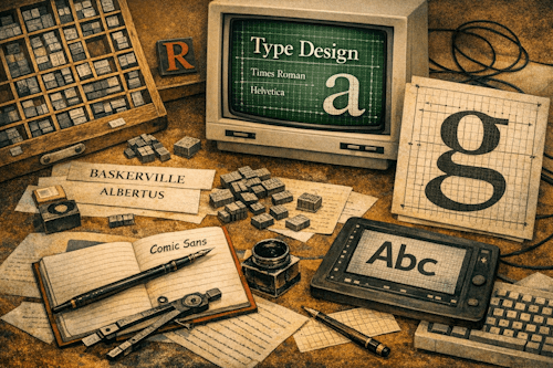
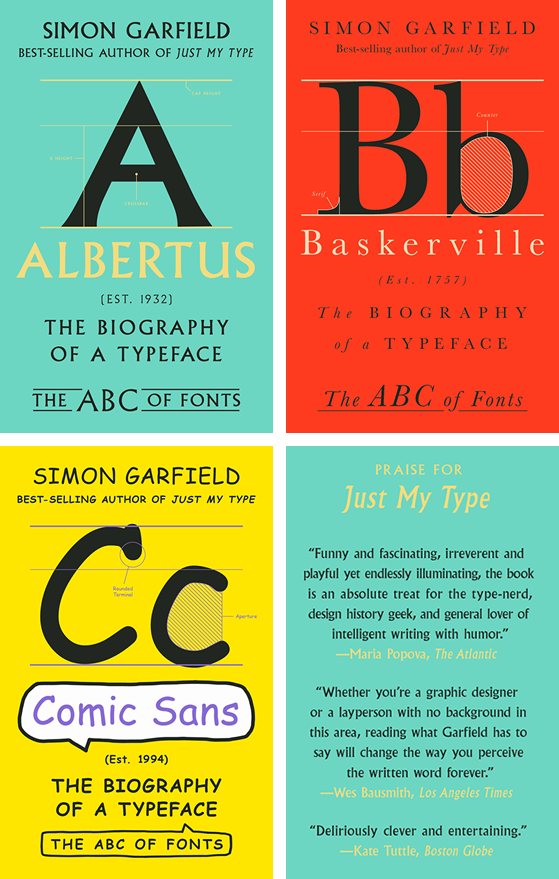
From reading printed books to reading messages off an Apple watch, Typefaces – and their fonts – have been interesting to me for a long time. I recently read three books by Simon Garfield that cover the history of three Typefaces: Albertus, Baskerville, and Comic Sans. First, if you have any interest in Typeface design, those are three short but fun & fascinating stories.
The ABC of Fonts books But before I go on, why am I writing about Typefaces/Fonts on a blog that’s supposed to be about writing with fountain pens? In the end, it’s all about the written word. Also, type design is an interesting combination of design skill, art, technical challenge, and visual treat. I’m absolutely no type designer; my understanding of type design is about as deep as ink on a page. But if you learn even a little about how “printed” letters on a screen/page are designed and used, it’s amazing how intricate and involved designing how even the tiniest letters is.
So I thought I’d just write a bit about how I learned about type design, what role it’s played in my life, and how I had a minuscule role in developing some of the first digital printer fonts in the 1980s. Basically, just some musing about the subject.
Going forward, I will often use the terms Type, Typeface, and Fonts interchangeably. Yes, Fonts are specific instances of a Typeface, and Type covers a much broader ground, but generally they are all about the design of letters put on a page or screen. In most cases, I’ll really mean Fonts.
Getting my hands inky
I guess the earliest time I was introduced to Type was in high school. I had a Latin class where we didn’t learn Latin as much as we played around with a small desktop mechanical printer, putting together pages with metal type to print. It was fun (to the detriment of my Latin skills – non-existent today), but also messy. The best part was finding the letters in the skinny drawers of a wooden type case.
It wasn’t as simple as just putting some reversed letters together. Letter spacing was tricky, especially when using italic fonts or deciding on size. I still don’t fully understand the rules of typography, but I got a sense of how intricate and involved it could become.
Using AI to design fonts for HP
Fast forwarding to college in San Francisco in the early 1980’s, where I fell into a small crowd of students who learned about AI and LISP programming from a wonderful, middle-aged, foul-mouthed Australian humanities professor who drove around in an original Land Rover. She provided me with an alternate view of computer science, one involving symbolic processing and thinking in parentheses.
She knew folks from Symbolics, which built “LISP machines” that were arguably the most advanced workstations at the time. I started to learn how to use expert systems and machine learning. (I’ll write up a separate story on that whole experience at some point.) Through her, I got the chance to use Symbolics systems directly, hanging out in their San Francisco offices.
I interviewed at Hewlett-Packard for an internship and got the job programming on more traditional business applications. After a summer there, I found out that a team at HP was looking for a LISP programmer with Symbolics experience. After 7 interviews, I got the job and started working 3 days a week for a newly formed group within the Industrial Design division of HP: the first-ever digital type foundry at the company. It may have been the first type foundry at any Silicon Valley company.
The job was to be the main (and only) “computer guy” supporting a small team of type and graphic designers who were trying out a graphical expert system application to design and produce digital type for the yet-to-be-released first laser printer, the HP LaserJet. This expert system was developed by the company Bitstream, the world’s first true digital type foundry.
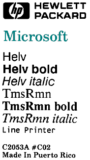
So, I was responsible for installing and getting this new-fangled advanced software running so that the type designers could start building digital fonts for the new printer. Technically speaking, I was the person who exported those digital font definitions from a Symbolics machine for Tms Rmn and Helv, HP’s versions of Times Roman and Helvetica – the first fonts for the LaserJet.
Fonts of the first consumer laser printer The Dutch Type designer Jan Molenkamp was the team leader who taught me a ton about what’s really involved in type design and why it’s so hard to get right. Although I’ve forgotten much of that, I remember that type design is a deep subject that requires a special set of skills far beyond being just a graphic designer.
While working for the team, I went to Stanford to attend many presentations by Donald Knuth on LaTeX and METAFONT, one of the earliest free implementations for formatting digital books with multiple fonts.
To learn more about the Bitstream software, Jan took me out to Boston for 3 weeks to spend long days at the Bitstream offices. That was a truly immersive experience, learning not just about type design but also about the new field of digital type design. Digital fonts had to consider not only the elegance of design but also how to make text legible on the low-resolution screens of the day. Fonts on screens couldn’t scale linearly, as the number of available pixels (and shades of grey) decreased with font size.
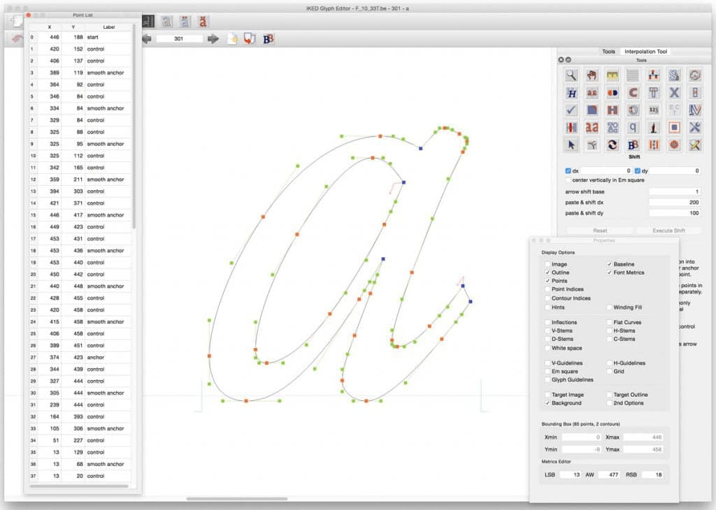
Unfortunately, I can’t find a screenshot of that Bitstream app running on a Symbolics system. Here’s a screenshot of a predecessor to Bitstream, the Fontmaster from the Netherlands, which shows a graphical UI for font design.
At Bitstream, I met one of the founders, Matthew Carter, who is a legendary figure in the Type Design world. He ended up designing many of the early Microsoft fonts in the 1990’s, as well as the highly specialized typeface Bell Centennial, for the big phone books printed at that time. Those tiny fonts had to work with high-speed printers so that the text remained legible, accounting for ink bleed on the cheap paper used. Matthew Carter gets mentioned multiple times in Simon Garfield’s books.
So many fonts!
I stayed with that Bay Area team for a year before moving to near Boston to work at Symbolics. I was no longer part of that Typography world, but it left its mark (imprint?) on my brain. Of course, as the digital world advanced exponentially over the next decades, so did the sophistication and availability of digital type.
Now there are many thousands of digital typefaces available across many platforms and display formats. Pulling down the Font menu on Microsoft Word now includes over 100 fonts already installed, with many hundreds more available for download. The world’s largest Type seller, Monotype (and eventual acquirer of Bitstream), now offers over 250,000 fonts across around 40,000 typefaces.
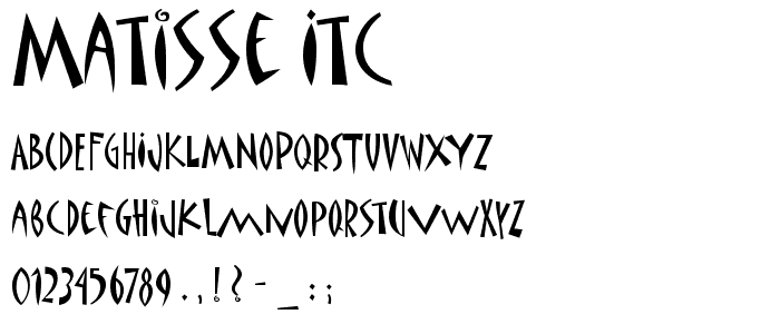
I had a lot of fun for a few years trying out early “handwriting” fonts available for PCs and Macs. The only digital typeface I actually bought was ITC Matisse. I used it on business cards and personalized notecards as it’s the design that I think best represents me.
I’ve gotten to the point, however, where I don’t spend much time picking the right font in PowerPoint or Word. Most of the time, the basic fonts work just fine for the business documents I write, and they have a half-life of about 5 days anyway. I spend a lot of time in coding tools writing markdown, so I just use whatever the defaults typically are.
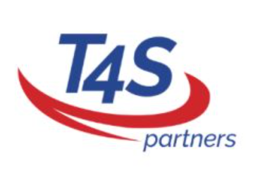
The only recent exception was when I chose the open source typeface Raleway as the default logo and presentation font for a small consulting company called T4S Partners that I helped start about a decade ago. It was largely because I loved the way the 4 dropped below the baseline, creating a logo that looks decent.
I still love looking at different fonts and typefaces, and reading about them. Next on my “Typeface” reading list is Simon Garfield’s book Just my Type and The Secret Life of Fonts by Simon Loxley. It’s all part of my fascination with the history of books, libraries, writing, and related topics. A topic for another day.
-
Sold off so many pens
I kind of went crazy buying fountain pens after COVID-19 hit a few years ago. It was a lot of fun trying out so many pens—from $2 pens to a few $600 pens and many more priced in between
I’ve now sold most of them on eBay, but I still have plenty of pens. I kept most of my Leonardo and Lamy pens, and I still have numerous cheap Chinese fountain pens that aren’t worth enough to sell on eBay. Maybe I’ll send a whole bunch together as a single offer.
Not surprisingly, they sold for less than the price I originally bought them at. But I got a fair amount back, especially for the higher-end pens.
I still have enough ink to last several lifetimes, along with many empty notebooks and a library’s worth of paper.
Now I just have to resist buy more pens, ink, and/or paper at the upcoming Colorado Pen Show.
-
A better pangram than Quick Brown Fox
Just a quick note regarding the “Quick brown fox” pangram that’s been used for so long. It’s boring. There’s a much better phrase that uses each letter of the alphabet.
Grumpy wizards make a toxic brew for the jovial queen.
This pangram comes from Garry Eves’, who has an excellent YouTube channel. All credit goes to him. You can find his videos at https://www.youtube.com/garryeves
-
Let’s start this…
Hi Pen Fans! I’m throwing my two bits on fountain pens, inks, paper, and related sundries. Hopefully, someone will find my comments interesting, perhaps amusing, and hopefully, at times, helpful.
The short bio: I’ve always been a fan of fountain pens. I grew up in Germany, where fountain pens remain a primary writing device. However, my handwriting has always been.. cacographic. well, hence the name of this blog. So I occasionally flirted with fountain pens, but it never fully stuck.
I remained an outside observer until about two years ago when the interest in fountain pens kicked in with a vengeance. Since then, I’ve acquired too many pens and far too many inks (and many types of paper), all while having a great time.
Over the next few months, I hope to participate and share – really, to give something back to the pen community, even though it’ll only be a fraction of what I’ve gotten out of the great collection of people out there, public and private, who share the same passion for FPIP (Fountain Pens, Inks, and Papers – Just made that up. No doubt there’s a better acronym.)
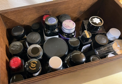
My first bottles. Now I’m up to three boxes of bottles alone. Don’t get me started on how many sample vials I have.
Here’s a few peculiarities about me and pens:
- With few exceptions, I only acquire purple pens (this includes lilac, violet, lavender, and other related colors & shades)
- With more exceptions, it’s the same with inks
- I don’t draw, color, do calligraphy, or do anything visually artistic with fountain pens. I write down words.
- I test a lot of papers (not anywhere as many as John @ Fountain Pen Love, though. He’s the fountain pen paper guru.) So I hope to tell you more about that soon.
And because we’re all into lists (thanks a lot Bullet Journal and Buzzfeed! /s), here’s a short one to start off with.
- Favorite nib size: Medium
- Favorite nib grind: Architect
- Favorite type of ink: Shimmer
- Favorite paper size: A5
Yes, I’ll make this site look a bit better, even if that does cut into my fountain pen time.
Oh, and I’m left-handed. More soon!
-
Subscribe
Subscribed
Already have a WordPress.com account? Log in now.
